

Mapping epidemics: nineteenth-century cholera maps of Leiden
In the nineteenth century, cholera outbreaks struck several cities in the Netherlands. Mapmakers struggled to aggregate the complex data gathered about the disease into clear cartographic images, a problem cartographers struggle with even today.
The current coronavirus pandemic has led to an ‘infodemic’ as well, an overload of data and information regarding the spread of the virus. This is also the case in the field of cartography. A wide variety of maps is produced in which all these data are spatially visualised. The ways in which these data are mapped, however, aren’t always correct. Basic cartographic rules are not always followed. A common mistake is that absolute totals are mapped as a choropleth map, that is a type of thematic map in which values are rendered for areas, and therefore always have to be relative. This misuse often leads to a misleading image, where large but sparsely populated regions dominate the cartographic image. When mapping the number of infections, one could better use dots, proportional circles or calculate the number of infections per 100,000 inhabitants for each counting area. Even more sophisticated are cartograms or anamorphoses, where the size of the areas are adjusted to their population.
The emergence of thematic mapping
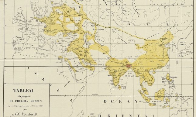
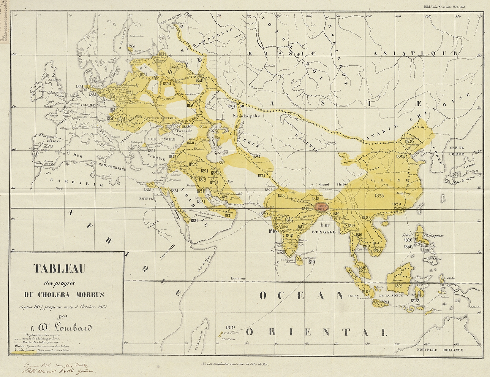
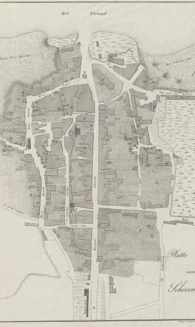
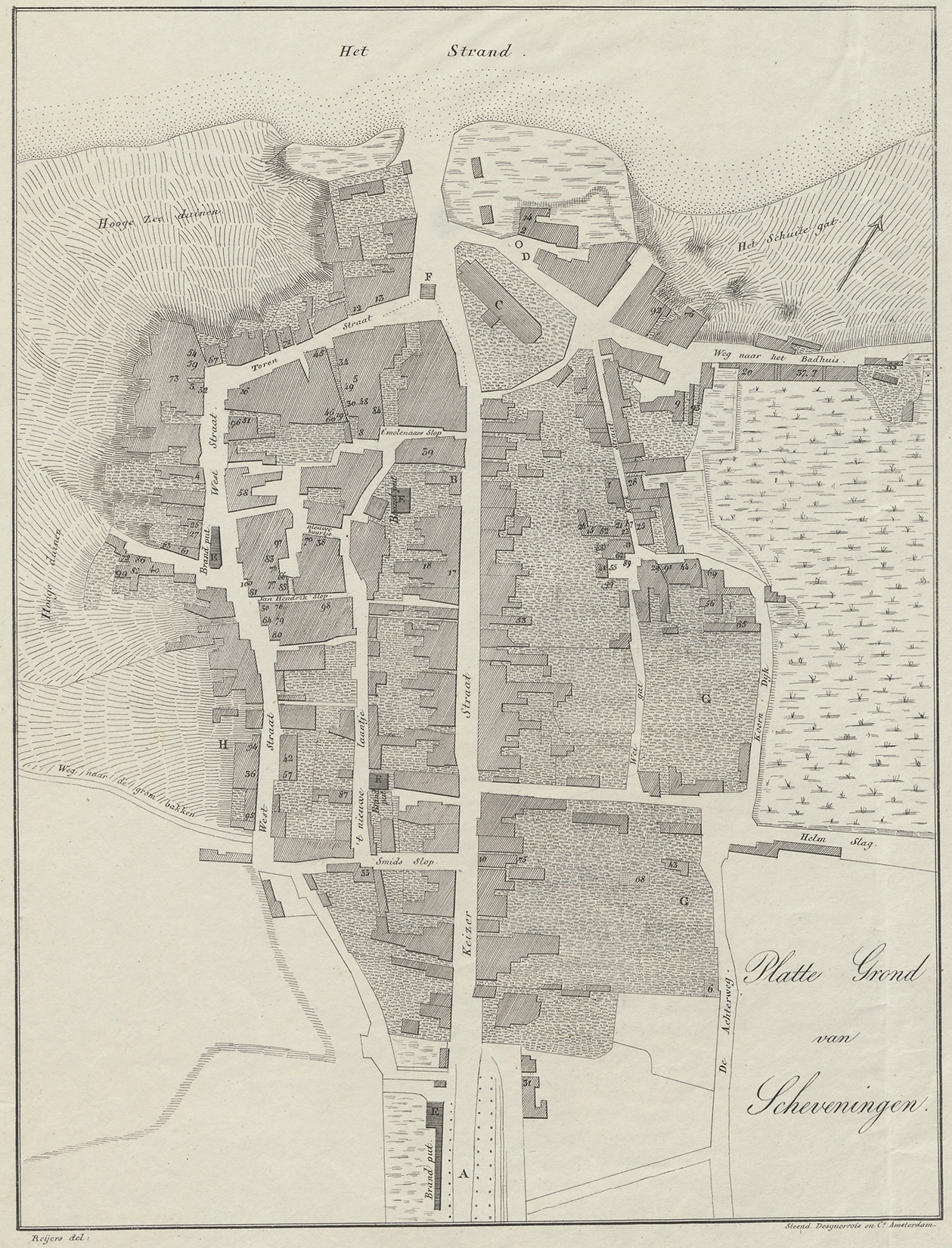
The struggle of mapping thematic information goes back centuries. Especially in the nineteenth-century thematic cartography developed quickly. Among the incentives for this development were the cholera epidemics that came in waves during that century. Originated in India in 1817, ‘Cholera Asiatica’ or ‘Cholera Orientalis’ spread to Russia and reached western Europe in 1831. In the Netherlands, the first contamination was diagnosed in Scheveningen at the end of June 1832. Fishermen had brought the disease from England to Holland. In the same year, more than 10,000 people died in the Netherlands of this first cholera epidemic, especially in cities in the densely populated western part of the country. In the map collection of Leiden University alone, town plans of Leiden, Amsterdam, Gouda, Groningen and Scheveningen are kept which all relate to the 1832 cholera outbreak. All these maps were published as part of local publications about the cholera outbreak of that year. It seems that there was a demand to map the spatial distribution of the disease from the beginning onwards.
The first cholera map of 1832
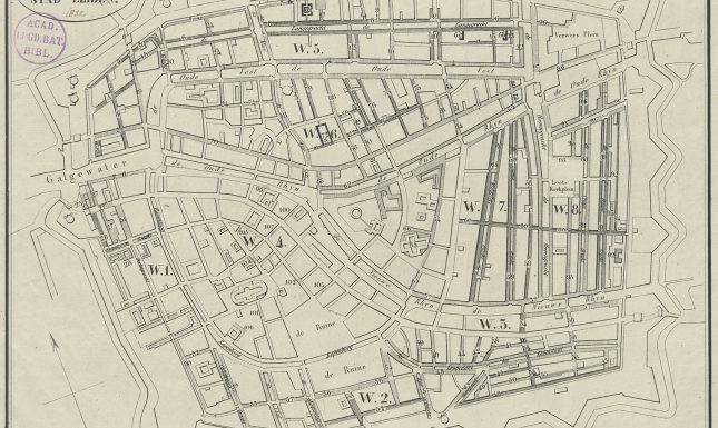
The plans of Amsterdam and Gouda only show the locations of specific cholera hospitals and a subdivision of the cities in neighbourhoods to organise the infection control. The plans of Groningen and Scheveningen indicate the addresses of the first 100 infected people with numbers, and can, therefore, be considered as early attempts of dot maps. The plan of Leiden indicates the number of deaths per street segment with variations in shading: a denser, darker shading for streets and neighbourhoods with more infections and a more open, lighter shading for streets with fewer infections. The hardest-hit places were some dead-end alleys and slums where the poorest inhabitants lived in unsanitary conditions. These alleys are indicated on the map in black. So, this map indicates four classes of intensity of the disease: white (for non-affected neighbourhoods), light shading, dark shading and black. The map was published in the book Geschiedverhaal van de cholera-epidemie te Leiden in 1832, written by three medical doctors from Leiden and published by C.C. van den Hoek in 1833. The book contains a lot of data in tabular form, on which the map is probably based. This is one of the oldest thematic maps that shows the spatial distribution of the epidemic in Europe, and probably is the oldest of its kind in the Netherlands. Although maybe not very precise yet, the map gives a clear overall picture of the spread over the city at a glance. It can be considered as an early choropleth-like map, although only the streets and not the complete counting areas are shaded.
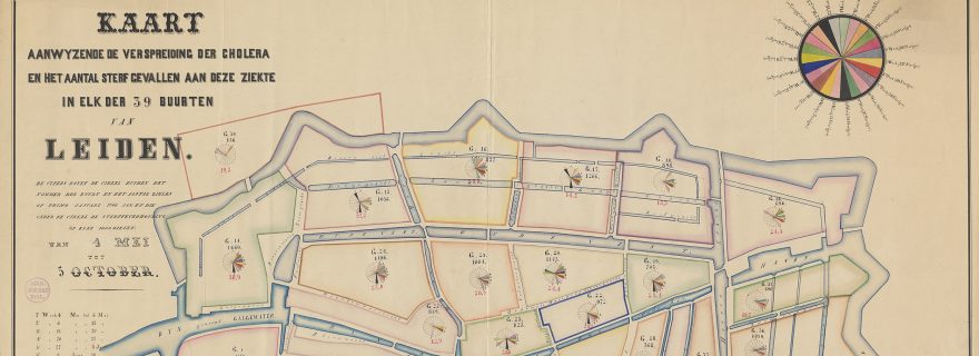
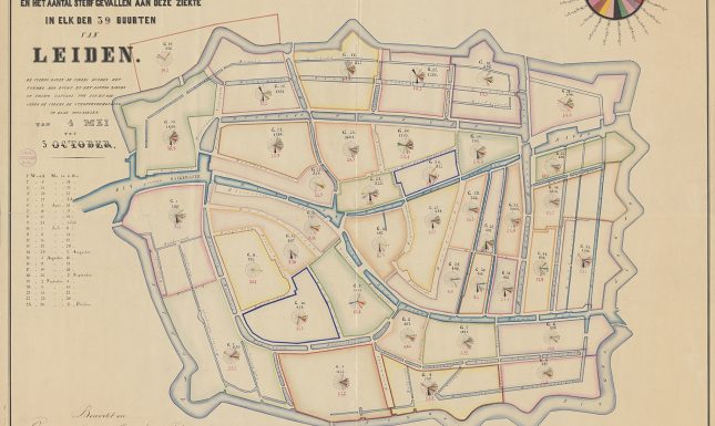
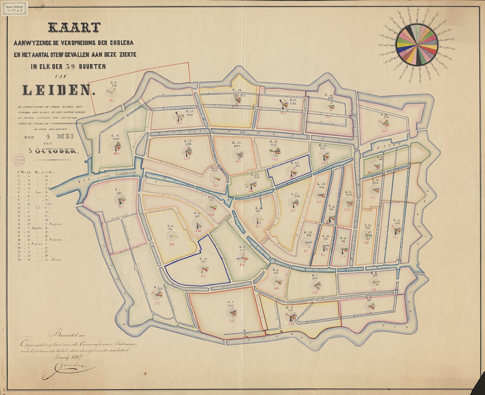
The epidemic of 1866: Leiden and Amsterdam
Surprisingly, no maps can be found of the major cholera epidemic of 1849 in the Netherlands. The next large cholera outbreak in the Netherlands in 1866, however, did lead to the production of maps. Well-known is the printed map of the distribution of infections and deaths in Amsterdam, compiled by a commission led by doctor Isaac Teixeira de Mattos. The city is subdivided in 50 districts and for each district, a circle diagram with the number of deaths per week is indicated. Lesser known is that a strikingly similar map is made for Leiden in the same year, although only in manuscript. The single known copy of this map, kept at Leiden University Libraries, shows the subdivision of the city in 39 neighbourhoods. The map was compiled by city architect J.W. Schaap in June 1867. Possibly he used the map by Teixeira de Mattos as an example for the design, but it could also have been the other way around since it is unclear which of the maps was made first. Both mapmakers were struggling with how to bring together the spatial and temporal data of the cholera outbreak in one clear map. Although the maps look colourful and contain a lot of information, we have to conclude that both mapmakers failed in communicating the data in one clear image. Both the temporal and spatial distribution of the number of deaths can’t be read by looking at these maps at a glance. The symbols are not proportional and the chosen colours for the consecutive weeks lack a clear order. On the other hand, both Teixeira de Mattos and Schaap related the number of deaths to the number of inhabitants per neighbourhood, indicated with a number per 1,000 inhabitants. The Leiden map is accompanied by a table and a chart. Especially in the line chart, the temporal spread of the infection can be clearly read. The first death during this epidemic occurred on the 4th of May 1866 and the epidemic clearly reached its peak in June.
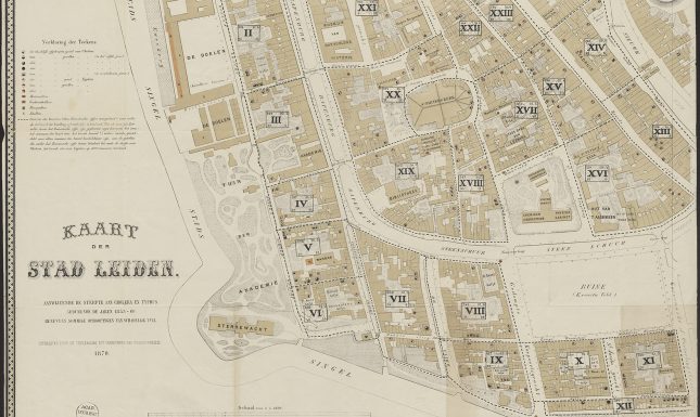
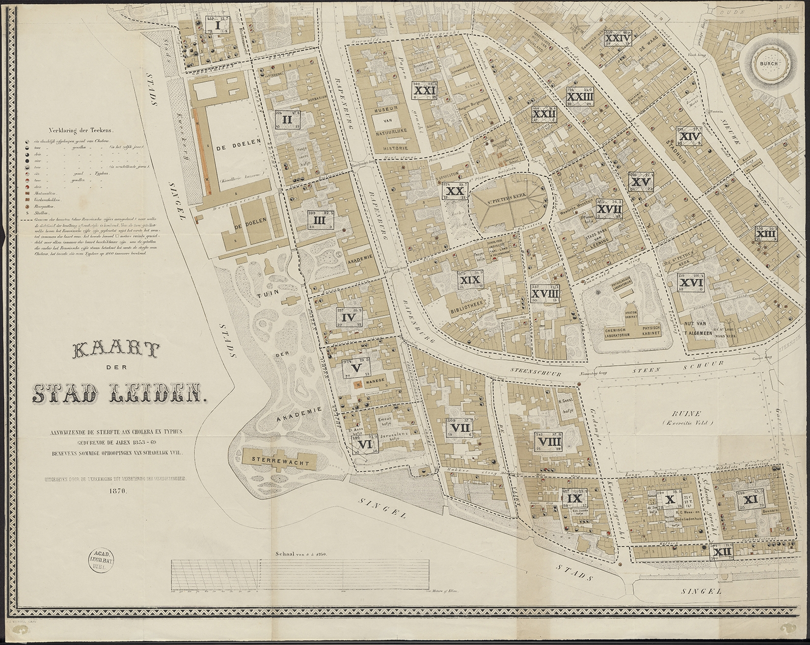
The detailed map of 1869-1874
Contrary to the plan of Amsterdam, the Leiden map of 1866 would not be printed. According to historian Heleen van der Weel (1999), it was initially the intention to make a lithography of the map. The reason this did not happen, probably was that another map was published soon after. This map was published by the Vereeniging tot Verbetering der Volksgezondheid te Leiden (Association for Improvement of Public Health in Leiden). This map indicates the deaths of cholera and typhus in the period 1853-1869. With symbols in black (cholera) and red (typhus), the number of deaths per address is indicated. A map with such precision could probably not be published today, because of limitations due to privacy of personal data: the cases can be traced to the level of individual addresses. Also indicated on the map are ‘accumulations of harmful dirt’: manure pits, pig pens, cesspits and stables. The map was printed on four sheets of which the first was published in 1869, although the date of publication indicated on the map is 1870. The fourth sheet was only published in 1874. That is probably the reason why this sheet is missing in the collection of Leiden University. The map is part of the bequest of the Leiden map collector J.T. Bodel Nijenhuis, who died in 1872.
In conclusion
The relatively large number of maps related to cholera epidemics in the Bodel Nijenhuis collection, often with some notes in Bodel’s hand, indicates that this map collector had a specific interest in maps of this topic. Not surprisingly, since this bacterial infection hit his hometown hard. During the first outbreak in 1832, he was 35 years old. When we look at the ways of mapping, it’s clear that nineteenth-century mapmakers were struggling to aggregate the complex spatial-temporal data to one clear cartographic image, understandably since thematic mapping was still emerging. On the other hand, looking at the difference in the quality of maps of the coronavirus, it is obvious that this struggle is still ongoing today.
Further reading
Marco van Egmond & Ferjan Ormeling, ‘Thematische kartografie van Nederland op internet.’ Geo-Info 3, 10 (2006): 408-414; ''Gronden der voorwereld, uit de tijden der mammouthen': Nederlandse thematische kaarten op internet.' Caert-Thresoor 26, 2 (2007): 29-38 (see also: https://bc.library.uu.nl/100-thematic-maps.html).
Tom Koch, Cartographies of disease. Maps, mapping and medicine. Redlands: ESRI Press, 2017.
Heleen van der Weel, ‘Epidemieën in het negentiende-eeuwse Leiden op medisch-topografische kaarten.’ Leids Jaarboekje 91 (1999): 118-142.